Search This Blog

Showing posts with label Skills W/S. Show all posts

Paper Folding/Scoring Workshop

Practicing folding and scoring paper in various ways to how 3D forms can be created from a 2 dimensional starting point within the assigned skills workshop.  Found the tasks useful and informative in how specific cuts and scores can alter the dynamics of a piece of paper to fabricate a new design.


I was given the net of a tray and given the task of folding and scoring the paper without any instruction as to how the net was meant to fit together.  Once I constructed the tray the second stage of the task was  to alter the structure of the net to give the tray an alternate purpose; I gave the tray the ability to close making it more reliable as nothing can be lost from within it.


Richard Sweeney


        Studies in paper. 2006

"Explorations in paper folding and constructed form.

Any form imaginable can be rendered through drawing, but when modelling in paper, an object has to be physically shaped. When faced with a flat sheet of material, there is no obvious indication of how it can be manipulated into a three dimensional object. The limitations of paper as a form making material offer a challenge, which through playful investigation results in tangible models."

Logos

Following the paper folding workshop, we were provided a sheet of logos and directed to select a few and alter the format of 2D layout.  These are the ones I selected and what I have done with them;


BMW Logo - I scored the inner circle and cut the centre design into quarters and lifted the sections out.  I like the initial idea of this but I would have preferred it if the sections didn't separate to create a whole dome on the top.


Walt Disney Logo - I drew the shape of the Disney castle and then did concertina type folds along the lines which would normally be negative space on the logo itself.  The folds lifted the logo giving it additional dimensions but it didn't look as good as I wanted it too; I think it looks untidy.


The Sun Newspaper Logo - I focused more on the actual background of the logo rather than the text being embossed as I thought this would be more difficult to achieve with just a single piece of paper.


I quite enjoyed this exercise as it forced me to think of ways 2D can be turned into 3D myself without relying on the guide lines instructing where to cut and score.

Packaging Design Research

I did some online research on unique and interesting packaging design in hope of finding some inspiration that could contribute towards designing my self promotional packaging.


identis Design - The packaging was designed for out_of_ark and I really like the concept behind the design which is based on street signs around the world ready for the "urban jungle".  The animals behind their cages are in a sense protecting the contents which I think is a clever way to have the product perceived.


Soda Seal - Johan DeBroyers


I mainly like the colour wheel that reseals the can more than the actual function of the product despite how innovative it is.

This research has allowed me to realise that whatever I decide to create for a self promotional package I want it to involve colour and for it to not be too complex as I believe that the outcomes of my own work is stronger when the initial idea is simple.  Before I can start planning and designing I need to research further into what type of audience I want to attract.

Laser Cutter W/S


Logo Ideas

I decided to focus on my logo before thinking about the type of packaging, hopefully I will get some  packaging inspiration along the way.


These are some finalised logo ideas that I've designed to "brand" myself.  I've decided to use my initials as they immediately refer to myself.


I am really pleased with all my logo outcomes and after some primary research as to which logo is the most aesthetically appealing, can be used within various parts of design and also is the strongest and most memorable. My results lead to the conclusion that this will be my chosen logo.  


Colour!

I found these corporate identity images for Knoll International while researching typography for inspiration and they reminded me that I want to include colour within my work and that my logo
could include aspects of colour within it.


Muller, L, 2007. Helvetica. 3rd ed. Switzerland: Lars Muller Publishers.


The initial impact of the logo doesn't alter when the colour changes.


Pop-Up?

I am continuing with using typography as my "theme" for this project as it seems to be the form of design I always seem to revert to.  For my packaging I would like to create a book of some sort with my information in a typographic layout inside.  

Before I came to this the conclusion I considered creating a pop-up type of book and I researched Marion Bataille's 'ABC3D' book.
Bataille, M, 2008. ABC3D. 1st ed. London: Bloomsbury Publishing.


And I did some 3 Dimensional sketches of a couple of the letter forms to see how it works and looks form alternate angles. 

I've decided against doing a pop up because I think that my typographic designs would be best displayed on pages within a book and they'd communicate my ideas much better than as a pop up.  I want to have my information as the typography designs inside the book using only singular words to summarise what I like to include and work with in my work.


I'm going have my logo on the cover with a colour changing strip that when pulled the triangle shape of my logo changes colour.  I experimented with a colour wheel and it was much less successful than the strip. 

Type Research

I struggled for a while for design inspiration and layout ideas so I did some research and found these images that interested me and some helped inspire me to create my own ideas for my 4 pieces of information; I was attracted to them by either their use of colour/layout/approach to design.

Names of the designers left-right:
Dmatri Aske
Todd Childers
Roberto de Viq de Cumptich
Tim Girvin
Jonny Hannah
Katie Lombardo

Heller, S, Talarico, H, 2011. Typo-Graphy Sketch-Books. 1st ed. London: Thames&Hudson Ltd.


Names of designers left-right:
Denis Y. Ichiyama
Dirk Fowler
Skouras Design Inc.

 Anderson, G, Heller, S, 2007. New Vintage Type. 1st ed. London: Thames&Hudson Ltd.


Colour Changing Logo

I really liked the idea of my logo being different colours so I came up with the idea of having a colour changing logo using a colour strip that can be manoeuvered so that the triangle background colour changes simultaneously.


            Vertical Strip                                                                                          Colour Wheel


Vertical Strip

Was the easiest to function as it was the most straight forward and the coloured boxes filled the logo space the best.  However, I think it takes up too much room on the side of the page and the tab's positioning prevent the right side of the page to be sealed.  I think a horizontal strip which pulls to the right would be better suited to this design.

Colour Wheel

The colour wheel was much less functional as the colours overlapped for the background, the wheel would have had to be much bigger which would probably take up too much space underneath.  Also the tab prevented the bottom right corner from being sealed as it would've stopped the wheel from being spun around.

4 Pieces Of Information

The "information" I'm going to use are single words which represent what I like to use/include/plays a role in my design process which I will present typographically in a concertina style book in a case baring my logo on the front and spine.

My words will be:
Colour
Composition
Hand Drawn
Imagination

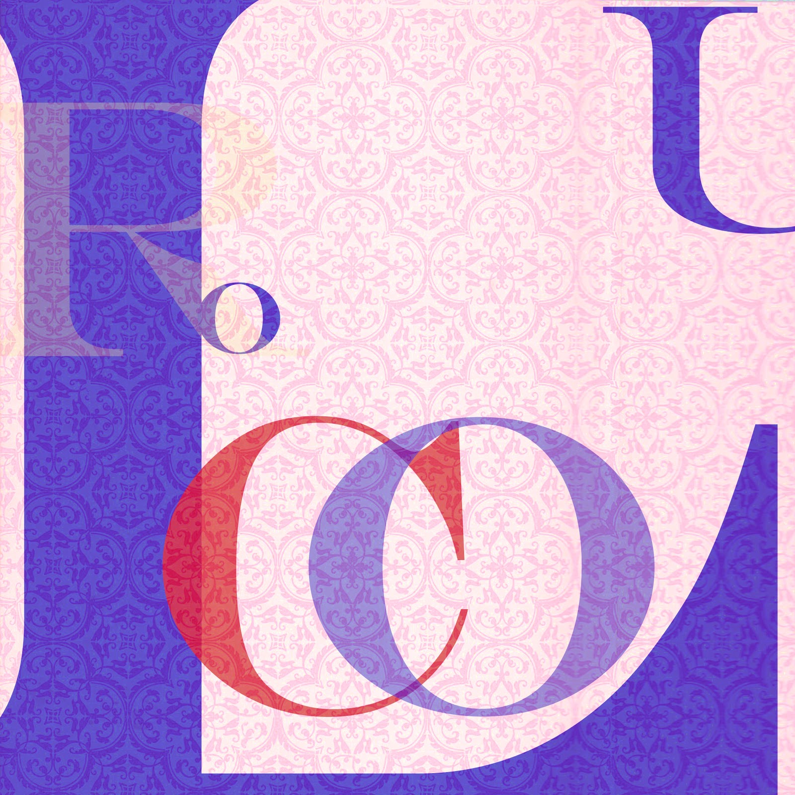
I originally wanted my layouts to be in circles but the idea failed because of the page shape, the images were boring, uninspiring and I felt they had something missing so I decided that square pages would be much more successful and present stronger images.


 - A couple failed circles..

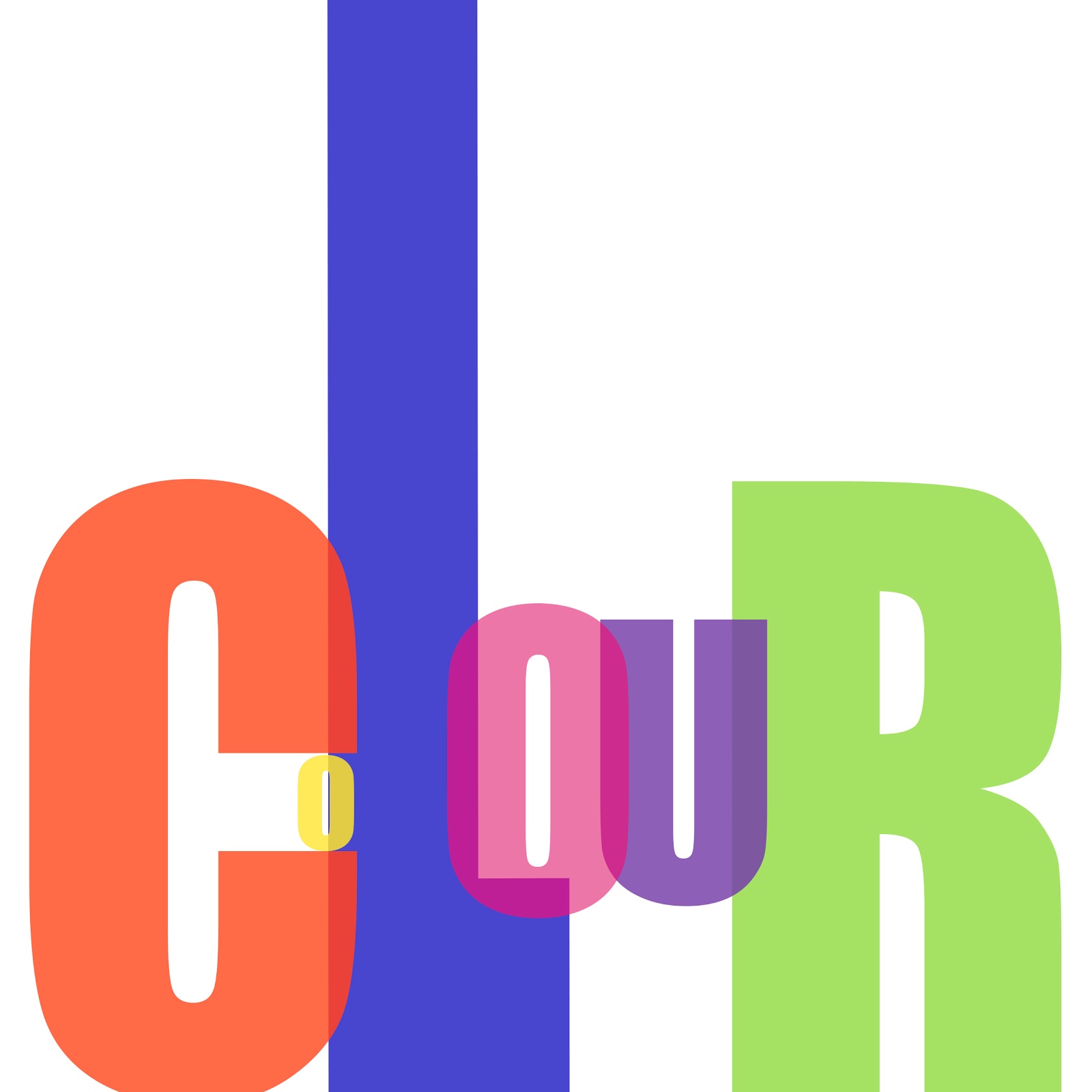
Colour


"Colour" thumbnails


Some ideas I came up with..


 My favourite is the final one which I will be including in my final package.

Composition


"Composition" design ideas


Some of the thumbnails I put into practice..


I liked quite a few of these designs but I preferred the final one to the rest because despite it looking like organised chaos it's legible and aesthetically interesting.


Handrawn


"Handrawn" thumbnails; wanted to add little hands onto the word and a pencil to push the meaning further, wanted this one to be a bit more quirky in comparison to the previous two.


 Really pleased with how they turned out but decided to use the final image because I feel its a combination of all the layouts and it works well.


Imagination


"Imagination"

Decided to experiment with a different approach to the word and looked into brain anatomy to find which part of the brain would most likely be home to the imagination which turned out to be the Occipital Lobe which functions visual perception and colour recognition.


This is the main concept I came up with and decided to use..